Colour is a part of design. Representation is not the final goal, but it’s a tool.
Representation, design and colour are strongly linked.
As for our experience, managing colour in all its representational opportunities, requires a multidisciplinary approach and therefore we invite students to adopt such an attitude.
To achieve this goal, the Department of Architecture launched a workshop within the Architectural Representation Techniques course, during 2011/2012 academic year.
The first step of such a workshop was to explain colour’s role in architecture through a series of activities focusing on various topics: “colour and volume” (colour’s contribution in emphasizing building’s shape), “colour and light” (the effect of warm or cold light in living spaces), “colour and function” (how colour can identify and characterise a building in our imaginary), “colour and contrast” (how a colour inversion could play a role in the urban scene). There are many other themes, but we chose to target just these ones in order to make the workshop much more effective.
The second step has taken into consideration living spaces, especially colour’s use to pursue living comfort as introduced since Mahnke’s theories. The workshop presented Mahnke ‘s semantic differential scale and the activities highlighted colours’ meanings and their perception related aspects. However, the idea of “comfort” should be connected with real needs of those who live in the residential space. For this reason, students were asked to imagine a real situation: WHAT (which space are we considering? i.e. : living room? Kitchen? Bathroom? Bedroom?), WHO (targeted people i.e. :young people? a family? an aged couple?), WHEN (the time-frame, i.e: evening? night? morning? Summer or winter?), WHERE (the location, i.e. sun exposition, latitude), HOW (ways to achieve the goal, i.e. colors, materials, contrast, furniture, etc.).
The project’s aim was to underline how the same space could change using different colours, materials and depending on the final users.
All students worked on the same setting, sketching with pencils. We decided not to rely on any software at the beginning of their training. Each student defined their own aims (WHAT, WHO, WHEN, WHERE, HOW) and their sketches were reviewed during a Workshop lead by Gianni Cagnazzo, architect and IEM’s (Indoor Environment Monitoring & Management Organization) president.
After the design’s process, students were asked to represent the scene using software and this lead to the next topics: “digital colour” (how to obtain a rendering considering materials’ properties, lighting condition, sun exposition, etc.) and “colour correction” (how to manage images according to the output devices).
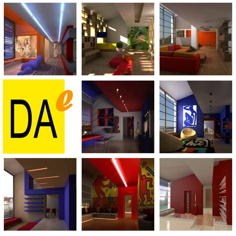
The work resulted in 100 sketches, 30 renderings (this latter activity was voluntary). This pages present some works.
From an educational perspective, this experience suggests an alternative dimension to “colour design” approach. Colour is a part of the design process and it plays a central role in each phase: from conception to representation, in our minds and in the printed sheet.
A designer must be able to manage the whole process.
For this reason, Ferrara Department of Architecture, together with EPSON Italia, is introducing colour management and correction in its didactic programs.
In the second Workshop (that will involve both Gianni Cagnazzo and Francesca Valan, and will focus on colour both in housing context and in the urban scene), students will make several printing experiences in order to learn and master all the required skills to obtain an effective print thanks to the EPSON Italia’s support, which, among the others, provided plotters, printers and video projectors. This process will help students to move from theory to practice as emerging in our teaching and professional experience, producing high quality print is today a professional competence and learning printing techniques should be included in architectural school’s educational programs as a core course.


